Carousel Sliders: Some Quick Improvements
When Flash started to gain traction in the web design community, it led a lot of people to experiment with new interfaces. One of the more popular ideas, which is still found today in various formats, is the carousel slider.

jQuery Carousel Evolution
The first iterations were fresh and exciting. They added new depth and functionality to websites, which was badly needed at the time. The internet was pretty plain before Flash. Sadly, many of the first carousels were more flashy than useful. There were two main problems: 1) Motion, 2) Navigation
The Motion Problem: The carousels were constantly spinning. Yes, I know that's what a real carousel does, but this is the internet—not a carnival. People are actually trying to look at the things on the carousel, and the motion makes it difficult.
When you're conveying information, be careful not to overdo the entertainment aspect.
The Navigation Problem: Many of the early carousels had no navigation buttons. Users had to hover their cursor over the items to make them slow down or change directions. As the cursor moved away from the center, the spinning would increase in speed. That meant that if you wanted to click on one of the items that wasn't in the center, moving your mouse toward it would actually make it move away from you more quickly. It was kind of irritating, actually.
Many of the modern carousels, which are largely javascript-based now, have addressed the two big problems. One example is found on a check ordering system by A-Systems Corporation.
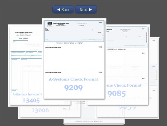
First, this version does not spin on its own. It will only move if you tell it to, like a well-behaved interface. "Sit. Good boy."
Second, it has Next and Back buttons. They're impossible to miss. One thing I really like about these navigation buttons is that they're right next to each other. If you're scrolling along and see something you like, you don't have to move the cursor to the opposite side of the screen to go back one slide. You can go back and forth quickly, which gives the user more confidence that they can tame the interface. This confidence increases the amount of time they're willing to engage with your site.
Something else I liked about this particular carousel is that you can instantly see a full-size version of the item by clicking on it. Usually when you want a full size image, a site will respond with a loading icon. This basically says to the user: "Just a second, I'll get that for you." That's pretty good. It's a big improvement over the early internet. But, we can still do better than "pretty good." What A-Systems has done here is preload the full-size check images, making it lightning quick to respond. No loading icon necessary. Again, this will help the users have more confidence that the site can give them what they need, which increases the time they stay on the site.
My conclusion here is that you can succeed with unique interface designs. Oftentimes, fancy designs and usable designs are at opposite ends of the spectrum. But, if you listen to your users, you can find ways to balance style and function. It only took a few simple tweaks to make the original, unwieldy carousel into a helpful, usable tool. It's usually those small tweaks that make the big difference.